“Don’t judge a book by its cover.”
But you do, don’t you? Subconsciously or not, you probably look at a cover’s colors, fonts, images, and aesthetics before you pick it up and decide to read it.
Whether a book cover should or shouldn’t hold such a great responsibility, it does, so the cover must be good. It should be good in the sense of a strong visual appeal and content relevance to the text.
In this blog-style series, I will be redesigning book covers to create more accurate, relevant, and visually appealing book covers. For the first installment of this series, I’ve attempted a redesign of an essential to the literary canon, deemed the best book of the past 125 years according to the New York Times Book Review: To Kill A Mockingbird. Harper Lee’s introspective novel on American culture, race, and prejudice continuously leaves a lasting impression on many.
The original book cover, designed by Shirley Smith, was published in 1960. It’s a simple cover that portrays the tree that Scout, the protagonist, discovers, having pieces of bubble gum on it that Boo Radley left behind. Scout, an unconventional girl, is raised by her brother and her widowed lawyer father, Atticus Finch. He encourages his kids to be empathetic and fair. Though the tree depicted on the original cover is a relevant and pivotal symbol to the novel, I used a different symbol: the mockingbird. The mockingbird is representative of innocence in the face of prejudice and injustice while also connecting to the book title.
I intended to keep the cover clean and straightforward, giving it a more modern design. The pencil-drawn mockingbird on the paper background represents the legacy Atticus draws in for his kids and Maycomb. Though he knows he most likely won’t win Tom Robinson’s case, he takes the case hoping to create a difference in the lives of the county. He sketches the change that he wants to see with the hope that it will have an impact.
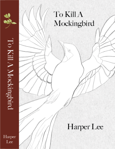
Along with these main components of the mockingbird and the simple, drawn-in style, I used small elements to complete the cover. While it has minimal color, I used the burgundy color of the original cover to give the redesign a sense of familiarity with what it is already known for. The choice of a more formal, serif font plays into the clean and simple cover.
So, if you were to see this cover on a bookshelf, you may pick it up and want to read it. Hopefully, you would get a sense of simplicity and hope—the kind of simpleness Scout discovers in human behavior and the hope Atticus continued to have in people.

