Entering a retail store, the first thing a person will do is turn right. Coincidence? Not so much. The majority of U.S. retail stores purposefully design their store to steer the customer to turn right.
According to Retail Minded, an international industry blog and publication, more than half of the world’s population is right-handed, meaning people tend to rely on and pay attention to their right side. This is known as the “invariant right.”
Making customers turn right is not the only strategy retail stores use. Depending on the layout, customers can be swayed to do anything from buying merchandise displays to viewing the products.
The most common layout at a grocery store is known as a grid layout. The purpose of the long, endless aisles is to make people buy products on impulse. As customers walk up and down aisles scavenging for the items on their list, they are bound to see every single product in that aisle and will eventually purchase an item on impulse.
“Long aisles can also ensure consumers see a lot [of products]. When we enter an aisle, it is usually easier to keep walking forward, especially with a cart. And so if the aisle is long, we become ‘trapped’ and see lots of products as we make our way to the end,” said Jennifer Argo, a marketing professor at the University of Alberta and an expert on consumer behavior.
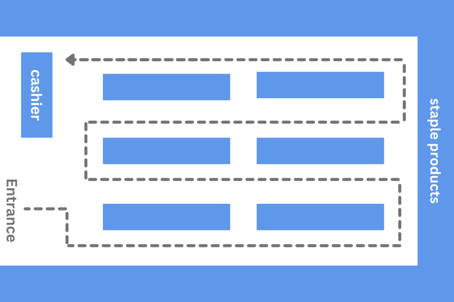
Argo also noted another layout called race track layout, famously used by Ikea.
“Ikea uses the race track layout wherein consumers follow an existing map, almost like a track that guides them through the entire store to ensure consumers see everything,” Argo said.
These are just some of the many layouts that different stores use to increase product exposure.
Oftentimes, stores switch things around, from adding new items to relocating sections of seasonal or trending products.
“Last year, a lot of people were wearing sweatpants, so we placed active loungewear towards the front. Once people started going back to work. We started to move the loungewear section towards the back,” said Karina Tang, the assistant general manager of merchandising at a local Old Navy store.
The change in layouts and inventory updates are not just to stay in trend but also to make consumers hunt for their items.
“[Moving things around] is intentional to get [customers] to get more stuff in their bag. While customers look for the item, they will bump into something else they like. And then they’re going to see something else and then another,” Tang said. “Many people don’t want to spend the time asking and would rather look for it themselves. Eventually, they end up with a whole armful of stuff in their hands.”
However, some people like Alexandrea Li, a senior at Carlmont and a frequent shopper, find it frustrating and difficult to shop.
“I don’t like it when they change the entire layout. It’s confusing. I have to re-memorize the layout again. I guess they do it as a marketing strategy to get people to buy more, but I don’t like it,” Li said.
Aisle spacing must also be taken into consideration when changing layouts.
“If they are in a narrow aisle, they can feel crowded, which can create anxiety and speed them up, rushing only to buy what is on their grocery list,” Argo said.
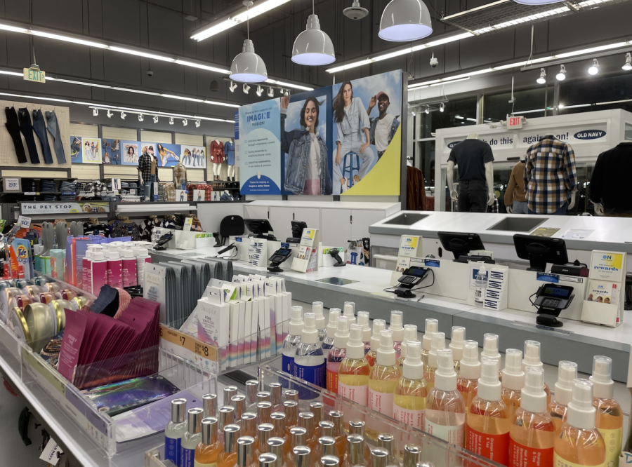
Planned layouts don’t just end on the sales floor. They can be seen near cashier registers as well.
“[The items before checkout] are all small and all at a small price point, like candy. Those are intentional so that people can add to their purchases. We call it a fast lane. When people add to their purchase, the bill increases, adding to our sales,” Tang said.
The strategy is called point-of-purchase placement, where quick and small items grab consumers’ attention while waiting in the checkout line.
“It definitely attracts customers into buying more, especially families with young kids because kids love candy. When I was a kid, I definitely wanted to buy them because I saw that they were at a low price point, but in reality, it is actually expensive,” Li said.
Stores also have merchandise placed near aisles precisely within arm’s reach. According to a research paper on consumer buying behaviors, a good merchandise display should feel like there is a “silent salesperson.” This “silent salesperson” would arrange discounted products near the aisles and create visually appealing price signs.
Another strategy used by retailers is cross merchandising, where certain products that complement each other are placed nearby. For example, at clothes stores, retailers put hoodies and sweatpants together. A customer who buys sweatpants will likely buy a hoodie to complete a coordinating outfit.
“[Complementing items next to each other] help the customer see visually what an outfit would look like together, so they don’t have to think about it. They can be like, ‘These items match. I want this entire outfit,’” Tang said.
Whether moving merchandise around or swapping sections, stores are built based on their customers’ needs to improve sales and shopper traffic.
Next time you walk into a store, be be mindful of how the story is set up.


